Blink Murder

The Main Task

Blink Murder is the name we gave to the film that we made the opening sequence for as part of our main task. The brief was to create a 2 minute opening sequence for a film of any genre, including titles and a soundtrack, with no copyrighted materials. Please click the HQ option at the side to view in high quality and improve your viewing experience! Enjoy : )

The Prelim - Ugliest Jumper Ever

The Preliminary Exercise

This is our preliminary exercise, which we called Ugliest Jumper Ever. The aim was to create a sequence demonstrating good continuity techniques, and had to show match on action, shot/reverse-shot, and the 180-degree rule. The brief stated that it had to be 30 seconds long, and comprise of a character opening a door, crossing a room, and sitting down in a chair opposite another character with whom s/he exchanges a few lines of dialogue. Again, please click the HQ option for a better viewing experience!

Tuesday, May 5, 2009

To The Moderator

Dear Moderator,
Welcome to my Foundation Portfolio blog!! Thanks for taking the time to look at this one and my group blog too, and I hope you enjoy them as much as I enjoyed creating them :)
I have my group blog linked to my individual blog, and hopefully it'll be easy to navigate - on the blog list on the right you'll find links to:
  • my group blog
  • the blogs for the other members of my group
  • our teacher's central blog, called BLK'S BLOG, which has links to all the student & group blogs

On my individual blog is all of my individual research, initial ideas, and planning, from the project's beginnings and mainly the early stages before we got into our groups. You'll also find my preliminary task work including the video, reflections on the project's development, and my responses to the evaluation questions.

My group blog has evidence of the planning and project development work as a group, and research that influenced and inspired our project that we did together.

I've linked my finished film opening sequence, Blink Murder, to both my individual blog and the group blog - it can be found at the top of the blog.

I've done my best to organise my blogs, so I hope you find it easy to navigate them :) All posts are organised in date order from November 2008, when we started the project, to February 2009 when we finished it. There are labels to identify all the research, planning, and evaluation work that I've completed on my individual blog. We've used the same system on the group blog, and I've also labelled the posts I was individually responsible for with my name.

I hope you like my blogs, and once again, enjoy!

Thank you! :)

Mia Obertelli 5610

Sunday, February 1, 2009

The Last Goodbye

So here it is! The end of our Film Coursework is nigh, and that can only mean one thing - well, lots of things, but what I mean is, of course, the closing of my blog!
This project has been so much fun, I've enjoyed working with my wonderful group of Bhavika, Bisma, and Mary, as well as everyone else in the media department! Thanks to Miss B and Miss T, and Ryan for putting up with all our group's problems and many, many reshoots etc. : )
From Ugliest Jumper Ever to Blink Murder, I've learnt LOADS, which is obviously what it's all about :P
So yes. This blog is now officially closed!
Until next time, byebye! xx

Pre-Evaluation Film Summary

Film Title: Blink Murder

Production Company: forty4 productions

Genre: Psychological horror/thriller


Synopsis: Emma is a university student and lives in North London with her housemate, Yasmin. Her boyfriend cheated on her and dumped her for a more attractive girl, increasing her insecurity and causing her to develop an obsession with image and physical beauty. She becomes incredibly jealous of attractive women, wishing to be like them, and seeing them as threats that have to be eliminated. Yasmin is completely oblivious, and no one would suspect Emma. As she leaves the house late one night to find her next victim, Yasmin goes to bed, unaware of her housemates late-night hobby...

The first half of the film involves Emma lengthening her list of beautiful female victims, and the audience also finds out a bit of the backstory. Eventually, Yasmin begins to suspect Emma, realising there is a hidden, monstrous side to her. She works out that Emma is the mysterious serial killer in the area, and almost meets the same fate as the other women when she confronts her, but Yasmin manages to escape. Emma eventually commits suicide, being unable to reach the state of perfection she desires, and realising that the game is up.

The Opening: shows a montage of clips showing Emma getting ready to go out, accompanied by unsettling music and broken up by title screens showing the production credits. There is a build up of very fast-paced cutting between shots of models' pictures cut out of magazines with the ghosting effect, while the track Edge of Madness plays, which leads up to the title: Blink Murder. The rest of the sequence shows Yasmin turning off a light, walking upstairs, and going to Emma's room, where Emma is just about to take the knife out of the drawer but is interrupted. They have a conversation and Yasmin goes to bed, leaving Emma to take the knife...

Music: An Upsetting Theme - double basses, glockenspiel, cellos - found on: http://incompetech.com/m/c/royalty-free/

Edge of Madness - rising atonal strings

Question 1

1) In what ways does your media product use, develop or challenge forms and conventions of real media products?
The film opening we came up with uses the formula of repetition and difference, utilizing some of the conventions of opening sequences in films [click here for more detail] and our chosen genre of the psychological horror/thriller [click here for more detail].
Our title sequence contains credits going all the way through (although originally it didn’t, and was one of the things we had to go back and change), making it clear that it is the opening and the main part of the film hasn’t started yet. Occasionally, films have short sequences before the credits start, e.g. Se7en (David Fincher, 1995), where the characters are introduced, and the enigma surrounding the murder, and then the title sequence begins. However, the start of the actual film is then marked out well, and I feel that the montage at the beginning of our sequence has a similar effect.
Our opening sequence also abides by Levi-Strauss’ narrative theory of binary opposites, with a very clear theme of good versus evil (the good represented by the sweet-natured housemate, Yasmin, the evil represented by the killer, Emma). Levi-Strauss’ theory is one that, unlike other narrative theories, can be found in all films, most obviously in the characters. For example, Bianca Stratford and her sister Kat in 10 Things I Hate About You (Gil Junger, 1999) are complete opposites, Bianca being the stereotypical popular girl to Kat’s nonconforming ‘antisocial’ feminist. [Click here for more on binary opposites.]
See Question 2 of the evaluation for more character detail.
As is conventional in horror films, the victims in our film are all female. Although this isn’t shown, it is strongly implied, when Yasmin talks about ‘awful things on the news’, and Emma’s reply mentions ‘all those poor women’. However, we decided to twist this and make the killer female too. As in other film openings we looked at which showed the character/s getting ready, such as Legally Blonde (Robert Luketic, 2001) [click here for a detailed post] and V for Vendetta (James McTeigue, 2005) [click here for a detailed post], we chose not to reveal the killer’s face immediately, and instead have a build-up to it after a series of CUs and ECUs. We originally intended to use contrapuntal sound in our sequence, but this was difficult given the fact that we had to use copyright-free music, and our ideas didn't fit, so we used very conventional suspense-building music. (See pre-evaluation summary for music detail)
We also had a section where Yasmin is walking up the stairs into a dark space, which is a conventional action in the horror genre, as it incorporates the fear of the unknown.
Similarly, the themes of revenge and extreme jealousy are also core to the plot of the film, and tend to be present in many films of the genre, such as Crush (Alison Maclean, 1992), where one character’s jealousy-provoked lies cause another to seek revenge on the object of the first’s jealousy. A more recent example is The Talented Mr Ripley (Anthony Minghella, 1999), which also explores the envy and instability of protagonist Tom Ripley, which causes him to turn into a murderer, just like Emma.

Another thing we did was to juxtapose the ideas of beauty with death and evil (see above for the literal juxtaposition in props), which presented beauty in a negative fashion, quite unusual for the genre, and presenting an interesting contrast.
We infused the convention from the film noir genre of the femme fatale in the character of Emma, a charming, alluring, but dangerous young woman, only with a more modern slant, twisting in psychological horror and thriller elements. Emma’s nails are painted red, she wears a red dress, and we show her applying bright red lipstick – typical of the femme fatale in classic film noirs, such as Chinatown's (Roman Polanski, 1974) Evelyn (see right).


A more modern example of the femme fatale is Mia Wallace of Pulp Fiction (Quentin Tarantino, 1994) (see left).

However, we broke conventions by breaking Todorov’s classic narrative pattern of

equilibrium -> disruption -> resolution -> restored order -> new equilibrium

by starting our opening with a disruption, with the introduction of a killer to an ordinary setting.
Our sequence is in real time, following a linear structure, and uses enigma codes to move the film along.

Question 2

2) How does your media product represent particular social groups?
Our film opening shows a young, white female, and an Asian female of about the same age. They appear to be sharing quite a nice house – the mise-en-scène indicates that they are middle-class, and are students aged around 19-20 years old. One piece of audience feedback we got from our screening was that our opening reminded them of the film Single White Female (Barbet Schroeder, 1992), as it focuses around two women sharing an apartment, one of whom has psychological issues.
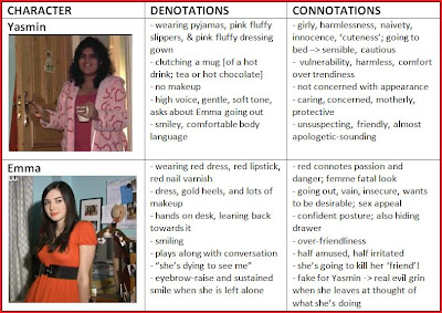
We represent two quite different female characters, who seem to possess some of the stereotypical characteristics associated with girls and women. However, they represent two different stereotypes of females, and have very different personalities, demonstrating Levi-Strauss' theory of binary oppositions.

Emma, the antagonist of our film, cares a lot about the way she looks, and is very insecure, aspiring to be like the models she sees in magazines. We reflected this with our careful choice of mise-en-scène; she has an enormous mirror on her desk, and around the frame of the mirror are stuck many pictures showing beautiful people, cut out of magazines. On the desk you can see a great deal of make-up, hair products, and perfume. When the drawer is opened, you can see typical ‘girly’ items, like nail varnish and ‘cute’ things, as well as an iPod, as other students would have, and Oscar Wilde’s The Picture of Dorian Gray – we thought this was rather fitting subtle addition as it is a book that focuses on beauty and aesthetics. These also add to the representation of a middle class, educated, intelligent (if slightly unhinged) student. The Complete Beauty Book is also very prominent; once again, the mise-en-scène is reflective of the antagonist’s personality.
However, although she has a lot of stereotypical female traits, her character has more depth and is taken to extremes – she is so envious of beautiful women that she kills them.
Both characters speak with English London accents, indicating the setting despite the absence of an establishing shot, which would have detracted from the unsettling, atmospheric effect we intended.
The relationship between the two characters is intended to be amicable – Yasmin likes and cares for Emma, and Emma likes Yasmin, finding her quite endearing, although she does sometimes get on her nerves and disrupt her plans.
We cast different ethnicities to reflect the diversity of culture, particularly in our setting of North London, and to echo developments in society and their impact on the film industry.

Question 3

3) What kind of media institution might distribute your media product and why?
Distribution is a major and fundamental part of the film industry, and deals with ‘launching and sustaining films in the market place’*. Theatrical distribution (showing the films at cinemas) is the usual way feature films open, and is the distribution filmmakers aim for, as ‘the cinema provides a uniquely immersive experience.’* This has shown to be the best method of increasing the profiles of films. The release plans for films are discussed by distributors with the producers, exhibitors, and others such as publicists, designers, and advertising agencies.
Our film opening has been described as 'edgy', 'artistic', and 'quirky' - the montage opening is unconventional and the audience are unsure as to exactly what to expect. These qualities distinguish it as an independent, arthouse film.
Our production company, forty4 productions, would work with a film distribution company such as Dogwoof Pictures to distribute our film, as large distribution companies would be too expensive. Dogwoof Pictures are noted for releasing a number of foreign language films, such as the documentary Viva Zapatero! (Sabina Guzzanti, 2005) [which I have on DVD :o], but not exclusively. They are UK-based and support small independent films in their release, and have released over 50 films since 2003.
Because our film product had a very low (virtually non-existent) budget it would be shown in more arty cinemas, where independent films run alongside a few blockbusters; this would be places like the Ritzy Picturehouse Cinema in Brixton, or the Phoenix Cinema in East Finchley, London, as they show films such as Moscow, Belgium (Christophe Van Rompaey, 2008), a Belgian film which would not generally be shown at big cinemas such as Cineworld. They also provide somewhere for local artists, including students, to showcase their work amongst similar standards in the Phoenix Gallery.
Alternatively, we could use the internet to showcase our film, on websites such as http://www.ukstudentfilms.co.uk/, where we would get a far higher potential global reach, or independent film festivals. Also, it is very clearly a British independent film, rather than an American one, with British actors, and a difference from high-budget American blockbusters; it would not be shown in mainstream cinemas, as apart from anything else, it would be too competitive and would not be worth it.
We could also exhibit our film at film festivals, such as the Raindance Film Festival in Piccadilly, London, where independent films are showcased and some are awarded prizes, such as last year’s ‘Film of the Festival’ winner, UK filmmaker Tom Tagholm’s About de Truffe.


*FDA website: http://www.launchingfilms.tv/distribution.php
Film Distributors’ Association [FDA]

Question 4

4) Who would be the audience for your media product?
The core audience for our film would be people in their late ‘teens, and, following the theory of Blumler and Katz, they would be likely to choose to watch our film as a means of diversion – it would attract the same sort of audience as films such as Francis Lawrence’s I Am Legend (2007), Nelson McCormick’s Prom Night (2008), and Disturbia (D.J. Caruso, 2007). The genre of horror in its broadest sense encapsulates our film’s genre, and our audience feedback showed us that it is a very popular genre, with 14 out of 20 people of our core target audience stating it as their favourite genre.
In fact, due to the genre of our film, age becomes almost irrelevant; as the characters are in their late teens, it will particularly attract an audience of the same age and those slightly younger, who hold aspirations to their (slightly) elders, but the genre has such a massive fanbase in itself that there is already a large amount of interest generated from that group. This is one of the reasons it is so important to get the balance between repetition and difference just right, and to create the right narrative image. We would not have as high a budget as Hollywood blockbusters would, and so would not be able to focus a great deal on ostentatious marketing, but would provide enough information in posters, trailers, and for word-of-mouth for the genre signifiers to be clear, but leaving narrative enigma. This then acts as a promise that the film will answer questions raised by the film’s publicity. Films such as the Saw (James Wan, 2004) series have such a strong branding and narrative image that they need very little information on posters – they can tell of a new film in the series, but without saying what will happen, acting as a teaser, enticing their fanbase to see the film even more.
We thought that we targeted both males and females quite well, as the females would be able to relate to the aspects of beauty and feelings of jealousy, as well as being interested by the story; the heterosexual males would be interested because of the plethora of beautiful girls that would be in it, and they would be able to relate to male characters, and as a horror/thriller, it would have a fitting amount of gore. However, our opening does show the film as being very feminine - there are two female characters, no mention of men, and contains very feminine themes. This would bring even greater appeal to women, particularly those who feel under-represented.
With a teen audience, it’s also likely that if two people in a relationship may go to see a film together, even if just one wants to go, so the boy/girlfriend of someone in the core audience help to make up the secondary audience. Similarly, parents accompanying their sons or daughters to the cinema are part of the secondary audience.